VIEW
THE PROJECT
Securing a Brand
Plainview's goal was to create a brand that established a heroic and secure image. Blake and Dan's vision unfolded through their passion for making a positive change. The goal for their company was to relieve stress from business and property owners.
- Logo Design
- Business Card Design
- Social Media Graphics
- Sticker Design
- Decal Design


TAKING A CUSTOM APPROACH
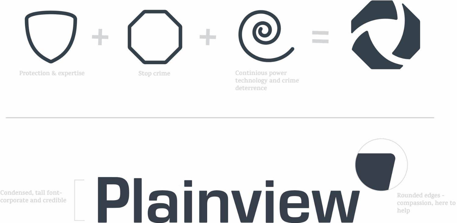
LOGO BREAKDOWN
The logo mark stemmed from three assets: a shield, stop sign, and a swirl. The meaning behind these assets feuled the final logo design. Blake and Dan's main concern was displaying compassion, this was portrayed through soft edges.


Get In Touch
Let's bring your
project to life
Submit this form to get a call back from one of our project strategists: Morgan, Rob, or Karrie. Or use this link to schedule a call at your convenience!